
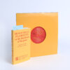
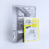
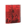
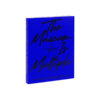
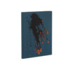
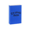
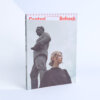
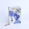
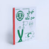
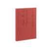
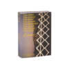
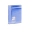
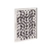
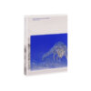
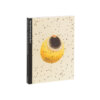
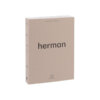
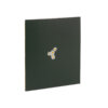
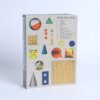
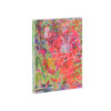
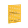
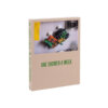
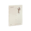
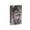
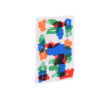

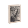
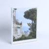

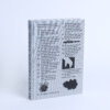

Two imposing, noisy cities such as Rome and Las Vegas are placed in parallel, brought together in a single format reminiscent of a magazine on the bedside table of a hotel room. The book’s design succeeds in visually blending the two empires while setting them apart by separating matte (Rome) and glossy (Vegas) paper.
This is a loud, assertive photographic book, the layout of the photographs is very classic, but the cover and binding method make this book stand out from the selection, and we admire the fact that they were able to push the concept of a bright, knock-out book. Its binding however receives some criticism from the student jury: because the large number of pages is stapled, the book is less easy to open restricting a subtle intake of the textual and photographic content.