
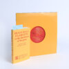
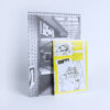
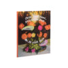
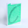
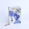
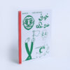
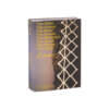
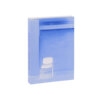
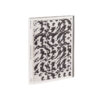
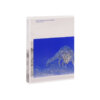
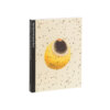
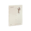
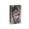
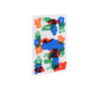

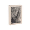
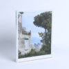


Two colors, two layers, two perspectives – intertwining, competing, and mingling. The first layer forms the foundation of the story: a series of black-and-white photographs that bring the scenery to life. Viewed individually, they become a visual atlas, guiding us through both the book and its landscape. At the same time, this layer serves as a canvas for the second – an overlay that hangs from the top of the pages like strips of fabric from Swiss drying towers.
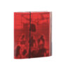
The second layer, printed entirely in red, subtly references the Turkish red dye once emblematic of Switzerland’s textile industry. This visual gesture makes the artistic research stand out, inviting viewers to explore it independently. Yet, through rasterization, the red images remain transparent, like projections that interact dynamically with the base. Both storylines contextualize and complete one another.
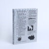
This duality carries through into the typographic concept: clear, grounded fonts ensure readability, while calligraphic flourishes and handwritten notes add a personal, intimate quality. The varied combination of photographs, documents, notes, sketches, textures and layered materials turns Forget Me Not into a richly constructed world – one where new paths and perspectives continually emerge.