
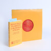
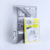
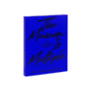
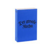

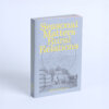

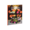
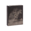


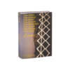
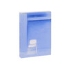
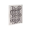
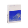
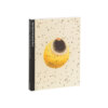



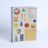
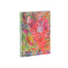
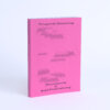
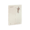

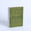
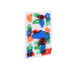

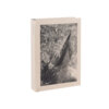


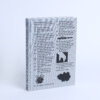

At first glance Encyclopedia of the Uncertain stands out due to its format and the prominent use of the color blue. Its substantial thickness and proportions give it a near-biblical presence, both physically and symbolically. The recurring blue tones create a textured, layered aesthetic that enriches the reader’s visual and tactile experience.
The layout strikes a careful balance between playfulness and clarity. A dynamic rhythm between text and imagery creates a sense of visual layering that feels intentional and engaging, without distracting from the content. This composition encourages exploration while maintaining overall coherence. However, the book’s thickness prevents it from lying open easily, which may impact its usability during extended reading sessions.
Nevertheless, the strong visual identity, thoughtful structure, and material design come together to form a cohesive and memorable publication. Encyclopedia of the Uncertain successfully translates its conceptual foundation into a tangible object that invites both curiosity and deeper reflection.