
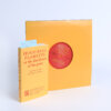
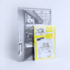
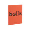
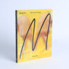
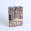
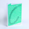
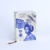
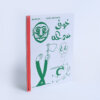
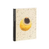
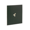
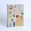
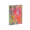
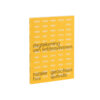
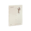

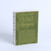
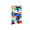
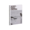
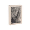
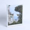
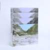
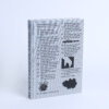
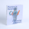
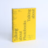

This book invites a slower, more deliberate kind of engagement. Not just to be looked at, but to really be read. The layout encourages this: images and text flow side by side in a rhythm that feels spacious and calm. The design offers room to think, to look twice, to pause.
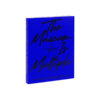
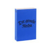
The blue printed cover stands out subtly, riding the wave of a broader design trend without leaning too hard into it. It’s used sparingly, purposefully. The same tone returns in the index at the back, a thoughtful echo that ties the whole together. Font choices are elegant and restrained, creating a clear hierarchy that allows both imagery and text to breathe.
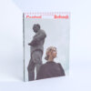
Photographs range from sweeping landscapes to tightly framed views of infrastructure and animals caught in the gaze of surveillance. These images are allowed space; nothing crowds them. The design doesn’t push, but guides — supporting the project’s deeper questions about control, connection, and the uneasy balance between human systems and natural movement.
It’s a book that feels quiet, but speaks volumes.