
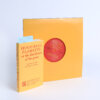
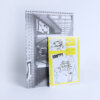
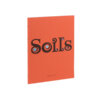
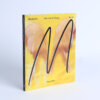
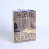
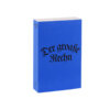
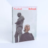
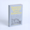
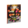
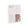
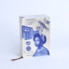
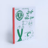
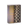
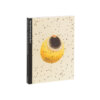
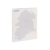
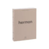
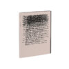
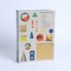
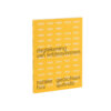
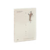
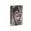
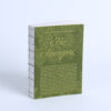
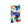
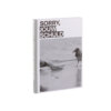
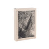
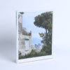
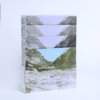
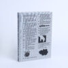
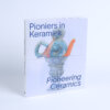
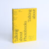

This book doesn’t just accompany an exhibition—it extends it. From the start, the translucent cover, layered with the names of all participating artists, sets the tone: open, collective, and in motion. There’s something refreshing about how it blends the roles of catalogue, design object, and spatial element. With four precise holes drilled through each page, it’s made to hang, just as it did in the exhibition. It lives both on the wall and in the hand.
The typography stands out: playful but consistent, shifting in size and weight to guide the eye with clarity and rhythm. Every choice feels intentional, from the balanced contrast to the generous spacing. The paper is beautifully chosen—firm yet not glossy, supporting both image and text with equal weight.