
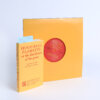
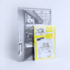
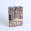
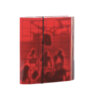
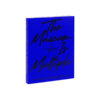
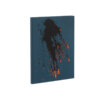
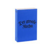
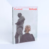
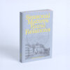
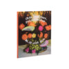
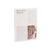

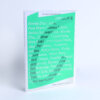
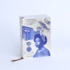
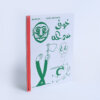
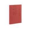
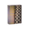
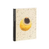
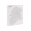
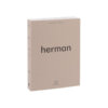
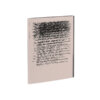
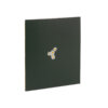
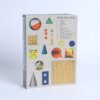
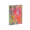
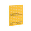
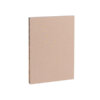
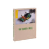
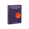
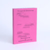
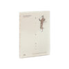
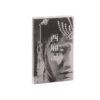
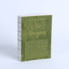
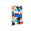

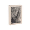
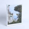

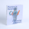
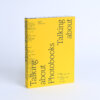

From the moment you pick it up, the book invites you to explore. The choice to place the table of contents on the cover is both bold and effective, seamlessly continuing onto the inside of the cover, giving a sense of direct access to what’s inside. It’s an intriguing start, one that sets the tone for a publication that doesn’t shy away from being a little unconventional.
Inside, the design feels distinct from the cover, yet equally captivating. The book is thoughtfully structured, with highlights from the private collection placed on thinner, shorter pages that break up the flow, creating moments of pause and reflection. The elegant pairing of fonts—used for both the main text and captions—adds a refined touch, balancing readability with style.
The use of half pages, a trend seen often this year, feels just right here, not overwhelming but still adding an unexpected visual element. The whole publication feels like a quiet treasure hunt, with each turn of the page revealing more about the collection, its stories, and the careful curation behind it.