
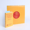
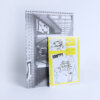
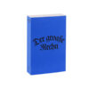
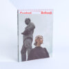
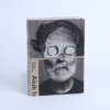
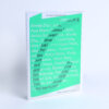
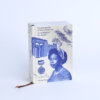
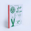
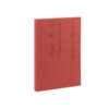
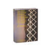
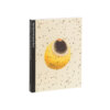
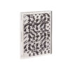
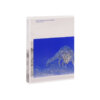
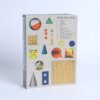
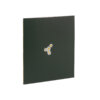
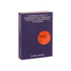
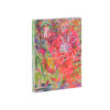
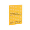
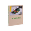
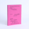
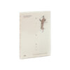
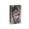
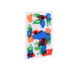
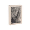

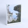

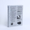

Everyone is familiar with the experience of the waiting room; but some have more experience of this than others. During a three-year period, Maaike Koning sat in a waiting room on some three hundred occasions – resulting in the photographs, collages and fictional waiting-room conversations that populate Wacht af. The general familiarity of ‘the waiting room’, the grain in the photos and the silhouettes cut out by Koning in her collages, mean that we can picture ourselves sitting in the waiting room as we leaf through the book – feel that we are sitting there, even. The image on the cover, of an empty chair in a likewise empty space, sets the tone.
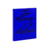
In the book’s interior, effective use is made of emptiness to represent the experience of waiting. The abundance of blank, white pages is the most powerful example of this. The fact that only these pages are numbered stresses this all the more. The book does not follow a fixed rhythm in terms of image, text and white space: each section is composed differently, allowing the whole to effectively put across an oppressive feeling of uncertainty. The sterile, medical blue of the cover is repeated in the text sections, creating a sense of cohesion throughout.
This is a small, impactful book that devotes attention in an idiosyncratic way to the non-place we all know better than we would like. In its modesty, and through extremely effective measures and a hard-hitting general atmosphere, Wacht af is a textbook example of a Best Dutch Book Design.