
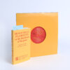
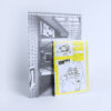
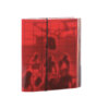
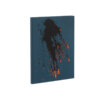
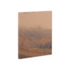
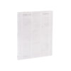
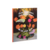
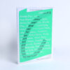
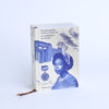
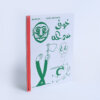
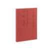
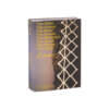
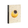
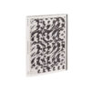
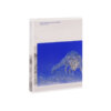
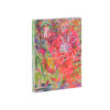
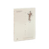
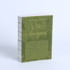
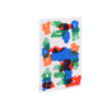
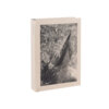
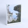
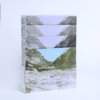

Felwa is on the one hand rooted in the Veluwe region of the Netherlands, and therefore extremely local, while on the other – with its questioning of change as the only constant – the book addresses a universal theme. The attention with which plants and their pigments have been taken as a guide in the process of experimentation with the photographs and content of the book, is palpable, and the resulting colour scales are intriguing. In terms of its typography, Felwa is rock-solid. Whatever its size – from titles to pagination, from body text to notes – the sleek, easily legible text exudes calm.
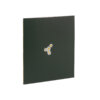
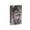
It is unfortunate that these text sections, together with the marvellous colour photographs and intriguing pigment sheets, are clamped between dark pictorial sections created in silver print on black paper, and an inexplicably heavy cover. At the same time, these dark elements, which seem to do little for the book’s content, also somehow contribute to the greatest strength of this book: it is a fantastic object. The way in which the boards are complementary to the fore edge, whereby this edge is accentuated by the bands formed by the various content layers in the book, and which also lend it the feel of a solid object, make this a truly exceptional product.