
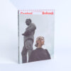
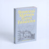
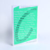
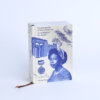
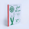
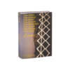
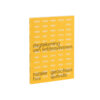
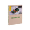
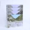
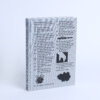

In 2018, the TarraWarra Museum of Art in Australia invited the Van Abbemuseum in Eindhoven to think about the location and history of the land on which the museum is built. This contemplation incorporated work both museums had been involved with for some time already; this became the pivot around which the exhibition Soils revolved. An important third partner was involved in the exhibition: the Struggles for Sovereignty network, which from its base in Yogyakarta strives for social and ecological justice along the lines of land, water, agriculture and food. In Soils, artists from Australia, Colombia, Indonesia, Mexico and the Netherlands explore the relationship between four types of ground: the earth, cultural ground, common ground and spiritual ground.
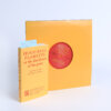
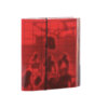
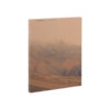
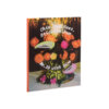
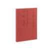
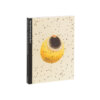
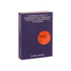
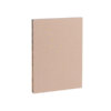
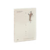
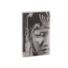
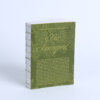
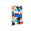
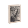
The red ochre colour of the cover of this book not only suits the theme of soil, but is also continued visually in a glowing earthy tint in the photographs in its interior. The effect is subtle, but intentional; the printer used an additional plate with a brown tint. Thanks to the thin paper used and the two staples used to hold it together, Soils feels like a notebook, and therefore accessible. The choice of squarefold, which creates a straight spine for the book with defined ribs under pressure, ensures that the book lies open nicely and that the notebook doesn’t feel like a magazine.
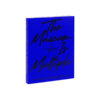
The font used for the title is bursting with character and curls opulently across the cover, feeling not so much like earth, but like everything that can grow in the soil. This association is continued in the interior, thanks to the footnotes that rise vertically from the foot of the page and curl around the body text in the margins. The fact that this book makes a lively, unified impression from a typography point of view, is due in part to the work of Joseph Churchward, the designer of the two fonts used: Samoaan and Nieuw-Zeelander. Both in its colour palette and in its typography, this accessible book is bursting with life.