
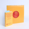
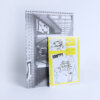
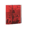
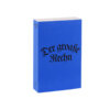
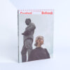
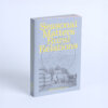

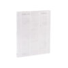
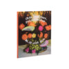
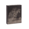
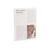
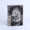
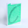
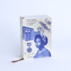
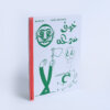
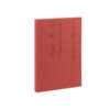
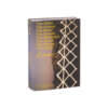
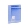
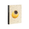
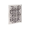
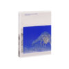
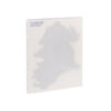
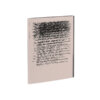
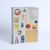
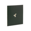
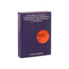
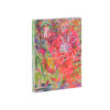
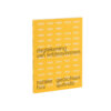
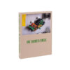
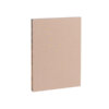
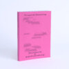
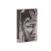
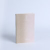
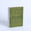
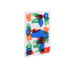
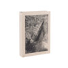
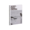
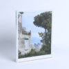
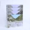
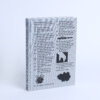

With almost two decades of exhibitions and publications to its name, Onomatopee has undoubtedly accumulated a rich archive. Reason enough in any event to thematise these archives by means of an exhibition and a publication. In ITS (IM)POSSIBLE FORMATION: The Book, the porosity of the book and the archive are explored through previous Onomatopee publications and a range of essays. The uniform light, uncoated, wood-containing paper used is the perfect embodiment of this porosity. The lack of a more substantial cover, the subtle accents provided by the binding thread and the enclosed bookmark in unhemmed textile mean that we readers are aware while reading of the structure of this book. This sense given by the object itself also corresponds well to the theme of porosity. The choice of a plastic cover, which surrounds this small, fragile book, contrasts with these physical properties, and in so doing unfortunately somewhat diminishes what is otherwise an expressive, accessible object.
The two-colour Risograph print is very well executed. The choice of gold ink to supplement the black activates the power inherent in the modest, effective design. The title pages demonstrate a wide-ranging historical understanding of typography. The golden ink plays with the tradition of illuminated capitals in Medieval handwritten works; within this, various design languages current within typographical movements (Jugendstil, Modernism and Futurism) are blended together in an attractive yet functional manner. ITS (IM)POSSIBLE FORMATION: The Book is a little book that is sure to have a big impact.