







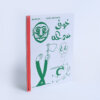







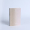
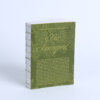
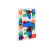
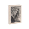



During the nineteenth century, the East of Switzerland was a global centre of textile production. Today, little of this industry remains. What we do still have, however, is the architecture that made this trade possible: the majestic hanging and drying towers in and on which coloured textiles were hung to dry. At least, some of these towers are still standing.
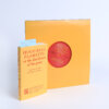
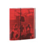
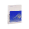
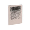
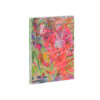
Forget Me Not contains a photographic atlas of these typically Swiss textile towers, as recorded by photographer Ladina Bischof, alongside research by artist Stéphanie Baechler into the phenomenon of the towers, recorded as in a diary. These two flows of information interweave throughout one another in a daring way, with the atlas photographs printed in black and the research in bright red. One technical refinement is that in the images printed in red, where they would overlap the black ink of the photographs, the black image is etched away. This allows the red to retain its full intensity and brings the research to the foreground.
This radical design and production choice facilitates a concrete interaction between the flows of information – whereby the question of whether the images on the spread have anything to do with one another is never completely answered. The few instances of spreads where only red or black fill the page make for a pleasant break in the rhythm of the book – perhaps choosing lighter lithographed black-and-white photographs might have resulted in a calmer experience for the reader.
The tone-on-tone use of differing reds throughout the book, the combination of script and sans serif fonts, the large format and well applied Patastar binding all go towards making Forget Me Not a Best Dutch Book Design. And Forget Me Not has not gone unnoticed outside of the Netherlands, winning the highest accolade at the Schönste Bücher Aus Aller Welt competition.