
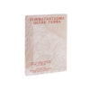
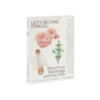
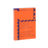
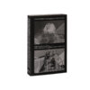
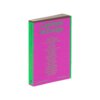
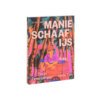
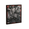
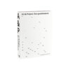
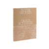
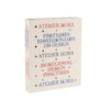
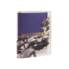
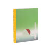
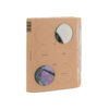
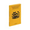
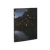
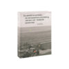

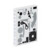
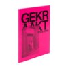
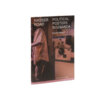
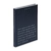
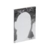

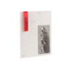
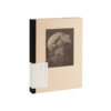
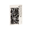
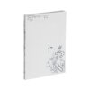
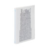
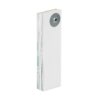
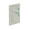
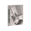
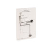
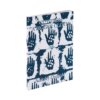




Klaas Gubbels absolutely bursts with what it has to offer the enthusiast. Thanks to rock-solid, colour-sensitive picture editing, a great wealth of Gubbels’ work has been brought together on paper – the double pull-out in particular is testament to the editing.
This is an object that in terms of choice of material is entirely appropriate to the material: the work is covered in everyday greyboard and it is interrupted by kraft paper – and, just like with Gubbels’ coffee pots, we suddenly see these materials in a new light. The way the bilingual text is handled is simple yet effective: the English text is printed on the kraft paper in negative. This makes the contrast between the languages so clear, that the twin flows of information are able to run through one another freely.
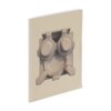
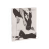
This is a thick book, but the choice of a soft cover means that it doesn’t come across as conceited. The seeming absence of the title from the front cover, as this is present only in the form of blind embossing, heightens this air of modesty. The cover, featuring complementary positive/negative pots front and back, sets the tone for the solid picture editing in the interior. The table of contents is placed alongside the cover illustration, starting at the bottom of the spine and continuing across the front cover under the image, which is a nice twist: not very functional at first glance, but this results in a pleasant dissonance – while at the same time giving some insight into the contents.
On the back we find, printed in small letters: ‘Printed and bound in the Netherlands’. In the light of the liquidation in January 2024 of Zwaan Lenoir, where this book was printed a year previously, this feels like a welcome call to arms.