
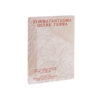
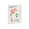
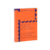
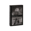
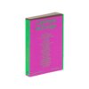
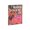
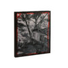
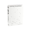
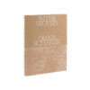
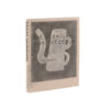
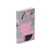
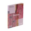
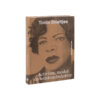
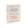
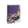
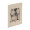
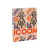
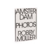
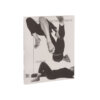
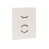
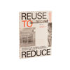
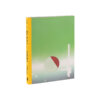
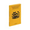
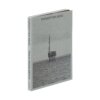
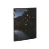
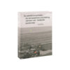
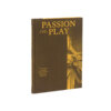
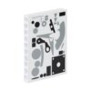
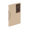
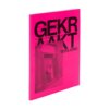
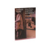
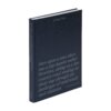
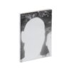
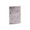
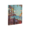
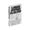
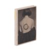
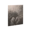
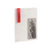
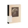
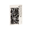
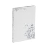
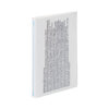
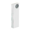
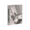
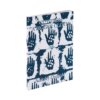
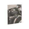
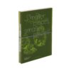
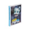

As an object, Six impossible things before breakfast bears a distinct resemblance to Open-Ended Visions of Reality – and given that both are published by Jap Sam Books, this is probably no coincidence. Although both play with openness in their form, they each achieve very different things.
A process of printing, overlaying, turning, re-photographing and then printing again brings about new interconnections in 25 years of the archive of gallery Verzameld Werk in Ghent. The interrelatedness between the images is obscured by the lack of pagination and the radical loose-leaf structure. The photographs of loose sheets, printed on loose sheets, add an optically disruptive layering to the work. It is hard to resist the urge to take the whole thing apart and display it. And there is nothing – except your preconceptions about what a book is – to stop you from doing so.
Here, with some three hundred pages, we see the ‘fish mouth’ – the fore edges not trimmed evenly on the cut, resulting in a concave block – in an extreme form, which (in combination with it being unbound) makes it more difficult to leaf through the book while holding it in your hand; half way through, the (lack of) trim turns against you, as it were. In as far as this may represent a problem, the makers have tackled this with the minimum of fuss: by printing the cover in such a way that to all intents and purposes it has two fronts and no back, they have ensured that the book likewise has no second half. When you reach the half-way point, you can simply close the book, flip it over and start leafing through again.
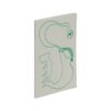
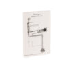
The die-cut circles on each front cover, which don’t quite overlap with the die-cuts in the inside flap of the same cover, are a subtle taster of how this book works: its layered nature, the creep (the horizontal shift in relative page positions towards the fore edge) and the resulting ‘fish mouth’.