
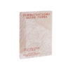
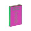
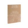
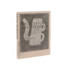
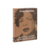
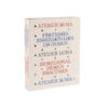
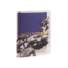
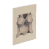
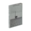
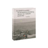
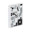
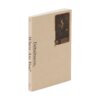
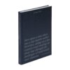
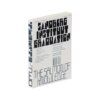
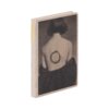
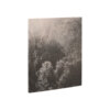
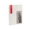
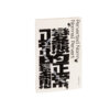
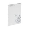
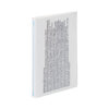
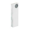
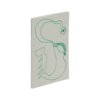
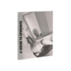
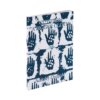
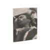
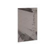
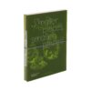
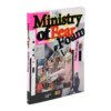
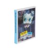

For some time now, we have noticed a trend with the book as part of an archival project, or as a design that plays with the idea of the book as an archival object. Far Away From Home is not the only example of this in this year’s selection, but through its form this book does best encapsulate the classic archive feel – without coming across as dated. This stack of A4s, half-bound in linen, gives rise to a suspicion that it may have been made at the copyshop round the corner, but as we leaf through we discover how much detail it contains: in terms of typography, picture editing and printing techniques. The designer has taken a long hard look at other examples and wondered how to create something new from these.
The content is intimidating: an exploration of concentration camps in the Netherlands, Germany, France, Poland and Austria where Dutch communists were murdered. As an object, this book manifests its theme well. The lack of pagination is an example of how the book allows us to flounder in its almost five-hundred pages of hard-to-fathom content.
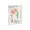
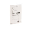
The raw reality of this content is abruptly interrupted when, inserted between the pages, a folded sheet appears, through which a pressed flower shines. This fragile, very different element contrasts with the theme and is entirely in line with the book’s form and content: the flower was picked in Dachau or Mauthausen. And in what other kind of book would you press a flower than in such a big, thick one as this? All of which makes Far Away From Home a highly distinctive, complete object.