
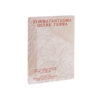
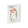
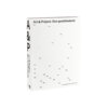
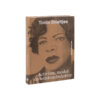
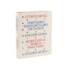
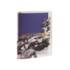
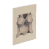

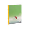
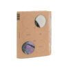

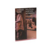
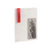
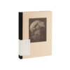
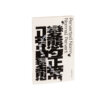
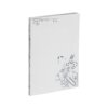

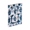
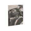
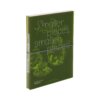


De wereld in het klein is a Best Dutch Book Design in every respect. As an indirect product of the coronavirus pandemic, when mother and daughter Caroline and Gloria – inspired by the biology exercise books of grandma Marie – got to know an area in the municipality of Krimpenerwaard, this sizeable but handy book is an ode to the hyperlocal. The two of them share their meetings with the miller, the archaeologist and the hunter, and record what they find out about starlings, clogs, biodiversity and much, much more. This makes the book highly relevant at a time when we in the Netherlands are rediscovering how we relate to the land on which we live and the animals around us.
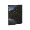
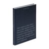
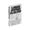
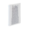
In terms of design, the book is characterised by an astonishing subtlety. The cover – in black and white except for seven small dots scattered across it – exemplifies this. In this case, there is not even a hint of the discrepancy, frequently seen in submissions, between the feel put across by the interior and the impression made by the cover.
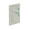
Having opened the book, we find a structure that allows for exceptions, which often leads to small surprises. Following the example of the cover, the interior is held together by subtle use of colour, with the same colour gradient running across the endpapers, the title pages of the chapters and the headings in the top margin.
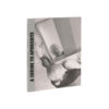
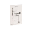
The range of (types of) text, illustrations and photographs on display is great; that these are marvellously interwoven throughout is thanks to strong editing and picture editing, sophisticated design and good lithography. This seamlessly concatenated collection of stories and images is full of surprises, is a delightful read and is sure not to spend too much time on your shelf.