
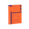
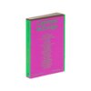
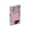
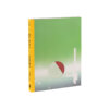
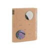
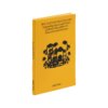
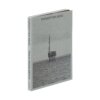
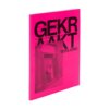
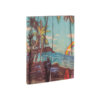
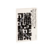
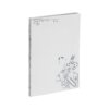
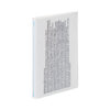
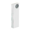
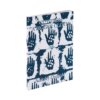
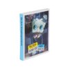

Manie Schaafijs leapt out of this year’s selection (with its many natural shades). The authors of this children’s book take us on a journey to Brazil, Suriname and Trinidad, and back. The fact that this book stands out among the selection is not only because of the choice for bright, almost fluorescent colours – a choice which, given that the theme is ‘shaved ice’, simply had to be made – but also thanks to the way in which these colours are printed. One thing that makes this scintillating use of colour even more powerful, is the choice to replace the magenta ink in the printing process with a pinker ink: Pantone 806U. This design and production choice bears expected fruit in the colour fields, text elements and illustrations printed entirely in Pantone 806U. More surprising is the effect this ink has on the darker colours, to which it lends a striking depth. The fact that precisely these darker colours occur in both the illustrations and the body text, binds the whole work together, subtly and convincingly.
Many of the books submitted are the result of a complex design brief: to bring together information flows in such a way as to make their diversity and their coherence clear. Here, this has been achieved: the brown-purple body text, the speech-bubble texts (and illustrations) and the background information, printed in bright pink, are interchanged with great clarity. Finally, with its soft cover, Manie Schaafijs breaks with the standard approach to books aimed at children. The jury appreciates the courage shown by the publisher in this respect.