
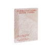
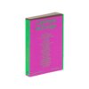
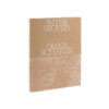
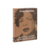
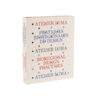
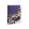
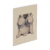
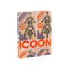

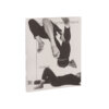
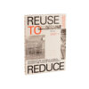
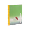
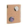
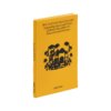
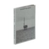
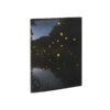
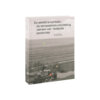
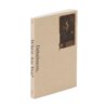
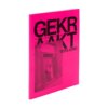
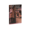
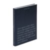
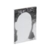
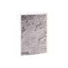
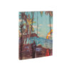
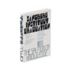
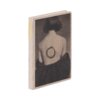
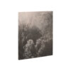
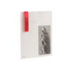
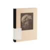
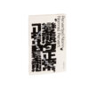
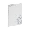
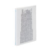
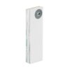
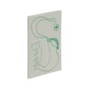
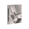
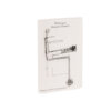
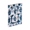
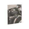
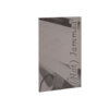


This special edition of Tosca stood head and shoulders above other literary submissions – in fact, this Tosca remains exceptional even compared to other special literary editions. The interior in this work of literature with a Japanese binding is printed only on the insides of the pages, meaning that at first the story is hidden from the reader. The pages are perforated along the fold on the fore edge, so the book invites you to gain access to the story yourself – by tearing the book open!
Tosca was by no means the only submission with a Japanese binding. It is, however, one of the few books to make effective use of this binding technique. A card is included with which the pages can be torn/cut open, but in practice this is not needed. Most of the pages are perfectly happy to be opened by a finger; with the more reluctant ones, this results in irregular fraying of the fore edge – a detail that makes your own copy even more special.
This book possesses an attractive radicalism. As a consumer, too all intents and purposes you’re buying an empty, white book and you’ll have to perform a bit of work before the content is revealed to you. In terms of typography, the reward for your efforts is on the small side – but this does nothing to diminish the fact that we’re dealing with a Best Book Design here.
For a book of approximately 200 pages of text, a bold, clear design choice has been made that seamlessly meshes with the content of the book. The blind embossed phrase on the back cover ( ‘She is a closed book; no one can read her better than I’) puts the reader on the right track.