
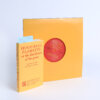
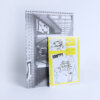
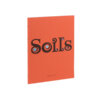
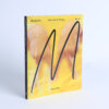
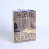
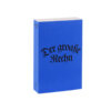
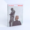
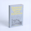
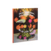
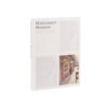
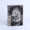
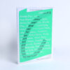
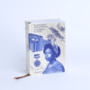
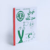
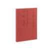
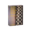
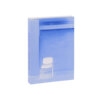
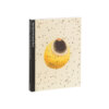
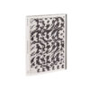
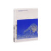
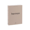
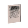
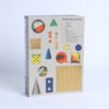
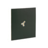
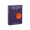
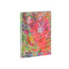
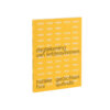
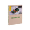
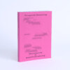
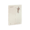
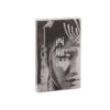
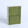
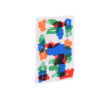
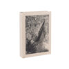
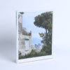

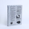
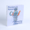
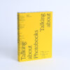

The weight and format of the book immediately signal a sense of intention, offering a tactile preview of what lies within. It has a blocky layout, oversized images and heavy typography command attention, while the use of white space guides the reader’s gaze back to the essence.
Minimalist yet assertive, the design speaks clearly: Don’t look for distractions — there are none. Focus on what’s being said. Black-and-white halftone imagery, staple binding, and a screen-printed linen spine evoke the raw, handmade feel of DIY zines — publications long associated with political activism and independent thought. These choices aren’t just aesthetic; they ground the book in a visual and cultural tradition of resistance.
Adding a touch of wit, the changing image along the book’s edge captures the spirit of the narrative. It’s playful, self-aware, and subtly ironic — perfectly echoing the tone of the content. In every detail, the design amplifies the story, becoming a part of the message itself.