
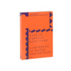
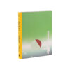
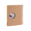
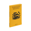
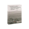
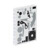
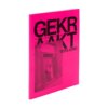
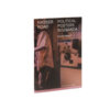
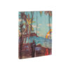
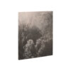
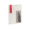
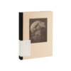
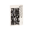
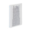
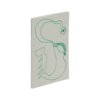
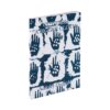
Smooth City by René Boer brings something different to the table, the type is a little bolder than most text based books, which not only makes it stand out, it makes it very readable. Colourful ‘smoothshapes’ made by designer Kees de Klein as an exploration into the subject, gives the text a visual representation and vibe. This, in combination with the system of dots on the inside of the book (made in collaboration with the author), gives the whole book a complete feeling.

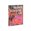






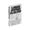






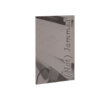
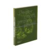


Smooth City
Against Urban Perfection, Towards Collective Alternatives

Edition: 2023
Date of publication: June 2023
Language: English
Image editor: Kees de Klein
Illustrator: Kees de Klein
Publisher: Valiz
Graphic designer: Kees de Klein (Amsterdam)
Lithographer: Wilco Art Books (Mariska Bijl), Amersfoort
Printer: Wilco Art Books, Amersfoort
Binder: Wilco Art Books, Amersfoort
DTP: Kees de Klein, Amsterdam
Size book block (w x h x d in mm): 120 x 190 x 17
Number of pages: 272
Print run: 2000
Price: € 22,50
ISBN: 978-94-93246-20-1
Font and foundry: Adobe Caslon Pro, Caslon OS, SF Pro Display
Binding style: Sewn softcover paperback, cold-glued
Paper for interior (grammage): 70gsm Holmen Cream 2.0, Igepa
Material cover (grammage): 240gsm sulfaatkarton
Special features: Cover printed full colour and Pantone metallic; interior printed in black and full colour (4 sections of 12 pages)