
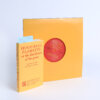

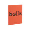
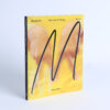
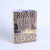
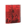





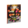
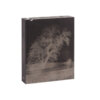


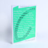
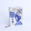
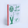

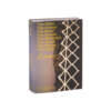

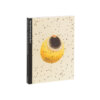

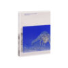




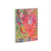

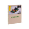

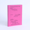
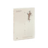

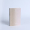
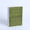
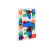
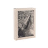

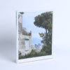

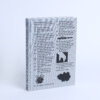

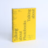

From the first touch, the book feels just right—substantial yet soft, with an uncoated paper that adds a gentle, natural texture. Its weight invites a slower pace, encouraging the reader to take their time. The photographs, drawn from personal archives and often worn by age, sit beautifully on the page, their quiet presence enhanced by the paper’s matte finish. Red captions, positioned so they almost touch the images, add a subtle sense of movement and playfulness within the otherwise structured layout.
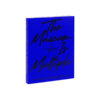
Chapters are organized from A to Z rather than numbered, each introduced by a dried local flower—from Arnica to Zea mais. These floral markers create a clear rhythm, making the book easy to browse without demanding a linear read. The deep blue cover, featuring a blackletter title arched in a half-circle, references traditional South Tyrolean aprons—still worn today—embroidered with sayings and symbols of everyday life.
Every element of the design feels intentional and grounded. It doesn’t distract from the content, but quietly amplifies it—offering a reading experience that is thoughtful, tactile, and full of quiet beauty.